CASE STUDY
Freshii
A white-label app, rebuilt from scratch into an ordering platform Freshii could call its own.
TIMELINE
3.8 years · 2021—24
ROLE
Sole Product Designer, later Designer + PM
TEAM
In-house Product, Design & Tech Ops · remote eng
PLATFORMS
iOS · Android · Web
OVERVIEW
One designer, one remote dev team, a whole app.
When I joined, Freshii's app wasn't really Freshii's. It ran on a white-labeled platform — the same ordering shell dozens of other brands used. It was expensive to maintain, every update crawled through a vendor, features lagged, and the experience showed it. Over the next 3.8 years I redesigned and rebuilt the ordering experience end to end, as the company's only designer and, later, as a product manager too.
THE CHALLENGE
Replace the rented app — without dropping a single order.
The mandate was to own the platform. That meant designing a complete ordering experience from zero, for a live national brand, with real stores and real guests depending on it every day.
01
Vendor lock-in
A white-label shell that was costly to run and slow to change — every update went through someone else.
02
Missing features
No real loyalty, gift cards, delivery, or promotions — the table stakes of a modern food app.
03
Poor experience
Customization, the heart of Freshii's menu, was clumsy where it needed to feel effortless.
04
Team of one
No established design process, a remote dev team, and stakeholders in ops, marketing, and leadership.
GETTING IN
Never block the menu.
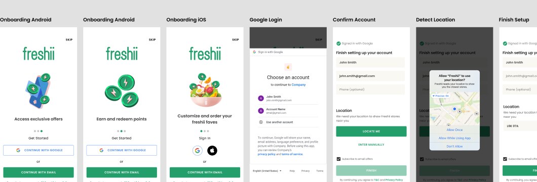
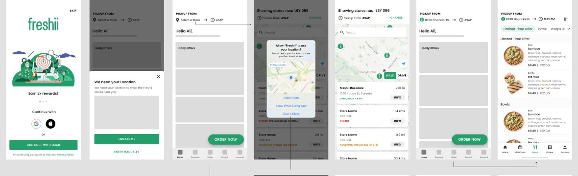
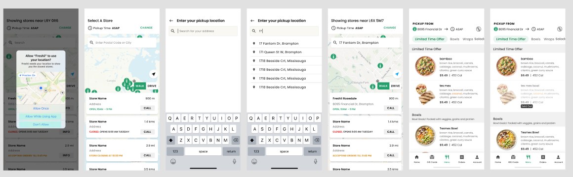
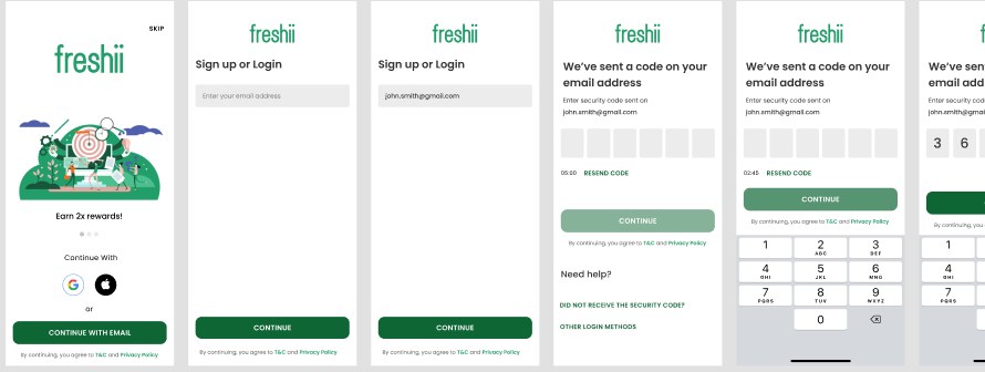
The old app put a wall in front of hungry people. We rebuilt the entry around one rule: browse first, commit later. A guest can find a store, build a bowl, and only then be asked who they are — and every answer to the location prompt, detected, entered, or denied, has a designed path.
THE CORE
The bowl is the interface.
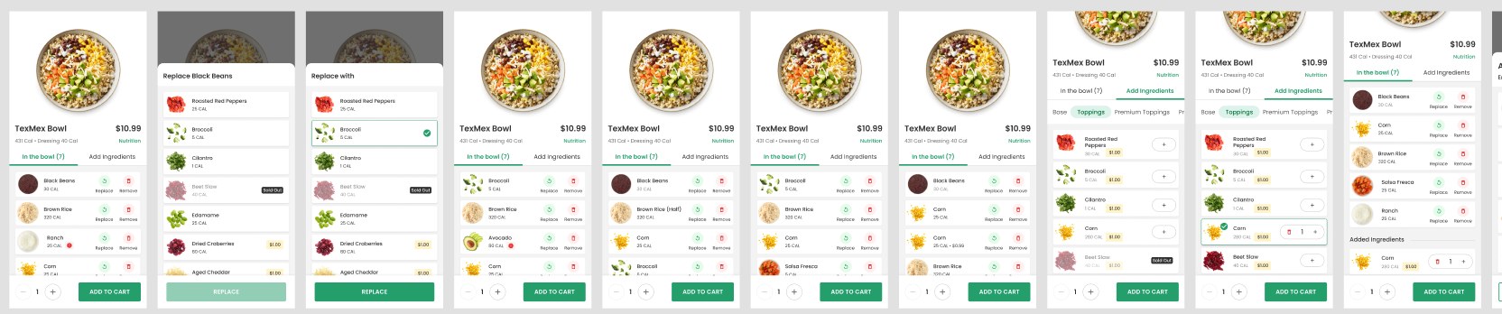
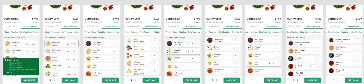
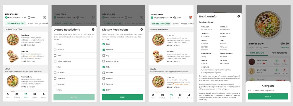
Freshii's menu is built on customization — swap, add, remove. This is where the white-label app fell shortest and where we invested most. Every ingredient is visible, editable, and priced, calories carry through the whole flow, and dietary filters and allergens are a tap away. Store selection got the same care: map and list views, live pickup times, and menus that respect what each location actually serves.
MONEY
Checkout, payments, and loyalty — on one screen.
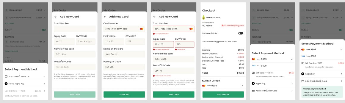
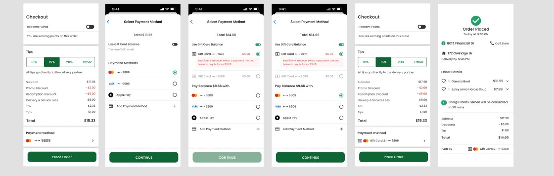
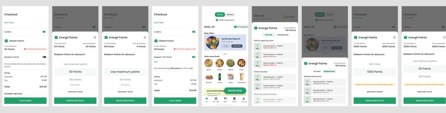
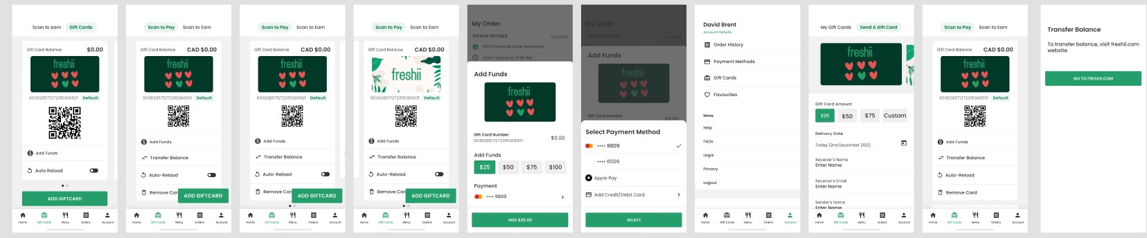
Checkout is where trust is won or lost, so we kept it on one screen: order details, cutlery, promos, points, tips, and payment, each editable in place. Around that spine sit Apple Pay and Google Pay, saved cards, gift cards with scan-to-pay and auto-reload, split payment, and the Energii points program — with every promo edge case designed as a state, not an error toast.
THE HARD PART
When the real world disagrees with the order.
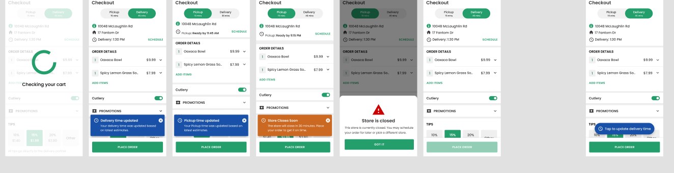
The deepest design work was the least glamorous: an address outside the delivery range, a store that closes before your pickup, breakfast items in a lunch cart, a delivery time that shifts after you hit place order. We designed the unhappy paths at the same fidelity as the happy ones — auto-switching stores, offering pickup when delivery can't happen, and conveying time changes honestly. Operations lived in these flows with us.

EVOLVING
Ship it, then never stop.
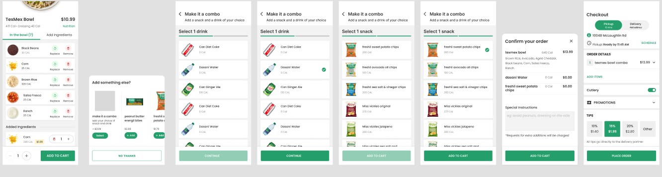
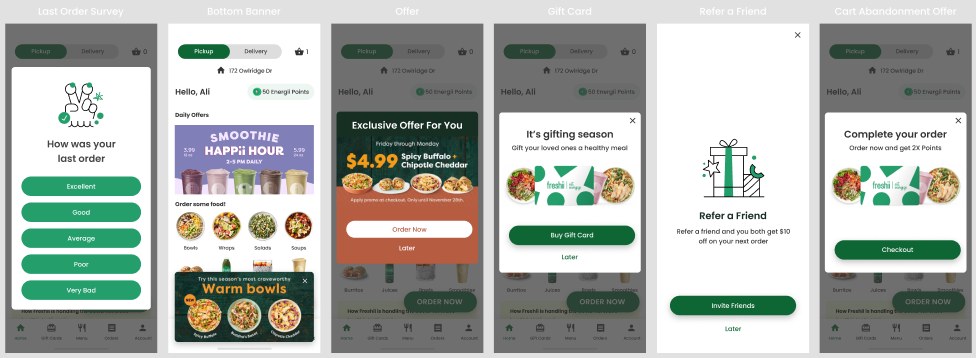
Owning the platform turned vendor negotiations into a release cadence we controlled. After launch the app kept earning its keep: checkout refinements from what we observed, cart upsell and build-a-combo, in-app messaging for offers and win-back, referral, and security work like 2FA and account deletion — the unglamorous features a real product accrues.
OUTCOME
From renting an app to owning a platform.
Freshii went from a generic rented shell to a platform designed around its actual menu, stores, and guests — shipping on the team's schedule, with loyalty, gift cards, delivery, and promotions the white-label product never offered. It changed my role too: from October 2022 I took on product management alongside design, leading initiatives across Foodtastic brands including Quesada, Second Cup, and Pita Pit. Owning one product end to end for three-plus years is the closest thing design has to compound interest.