Case study
Freshii Ordering Platforms
Enabling users to order ahead via the app or the website — a white-label platform rebuilt in-house, from the ground up.
7 min read
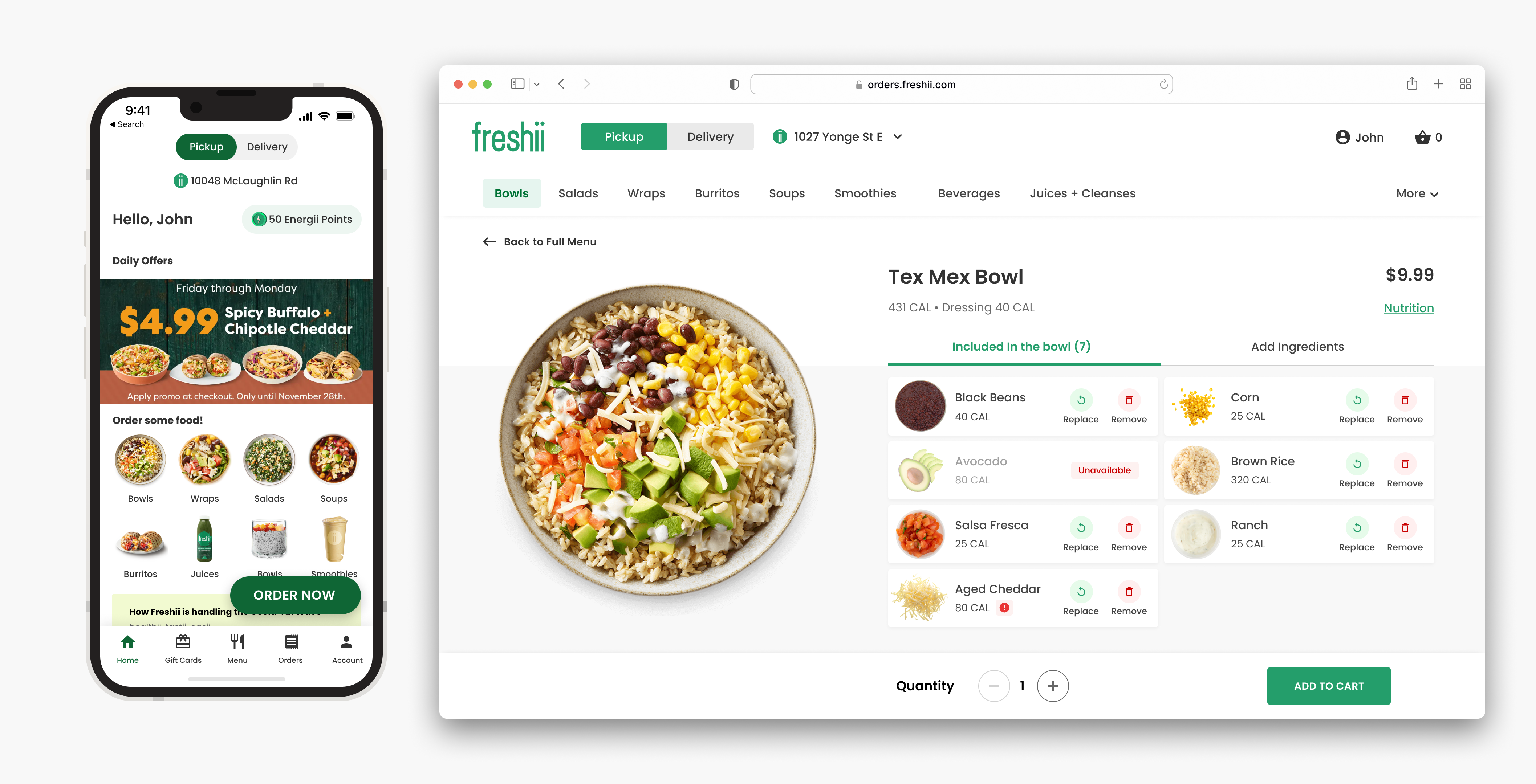
155K users
Since launch
2.1 → 4.5
App Store rating
3 platforms
Rebuilt solo → team
Background
A white-labeled platform, at a white-label cost.
Freshii already had an ordering platform, built and run through a third-party vendor. The cost of running it per partner location was high, and the turnaround time for fixing critical issues or shipping new features was slow — with next to no control over the actual user experience.
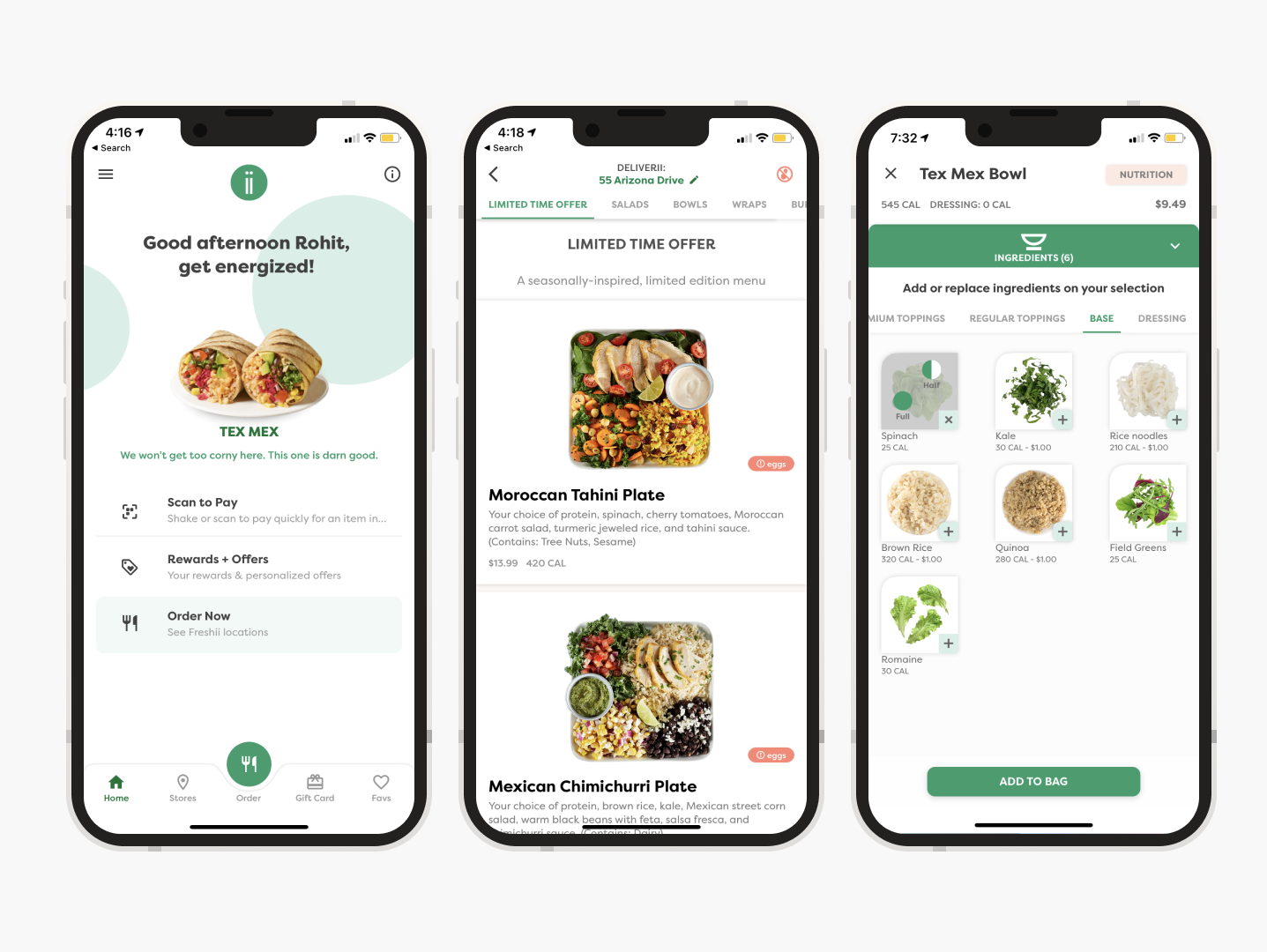
Build a new ordering platform, in-house — one that was cost-effective, gave us the roadmap, and let us address critical issues with a faster turnaround.
The mandate: own the platform enough to grow KPIs and sales, not just maintain the status quo.
Key principles
Three numbers to design around.
- 01 Speed to menu. Get users to the menu fast by selecting the closest store for pickup or delivery.
- 02 Fast re-ordering. 90% of app users were re-ordering — that feature had to be effortless to reach.
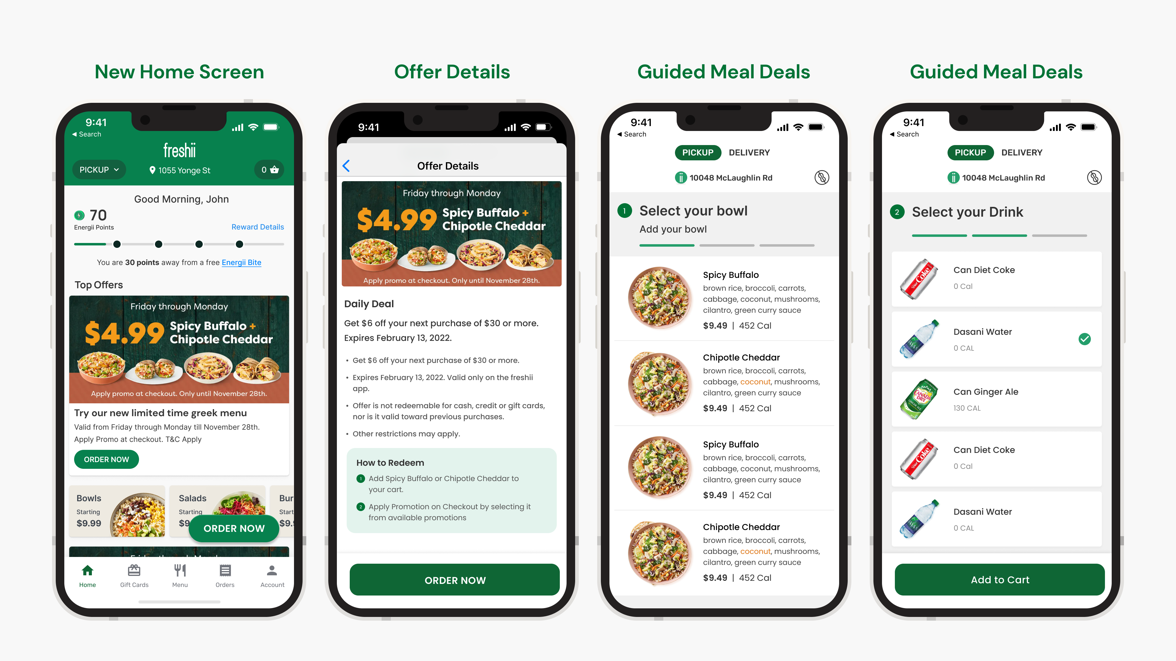
- 03 Increase average check size. Grow cheque size for partners through upselling, combos, and meal deals.
Key features
Four capabilities the old platform didn't have.
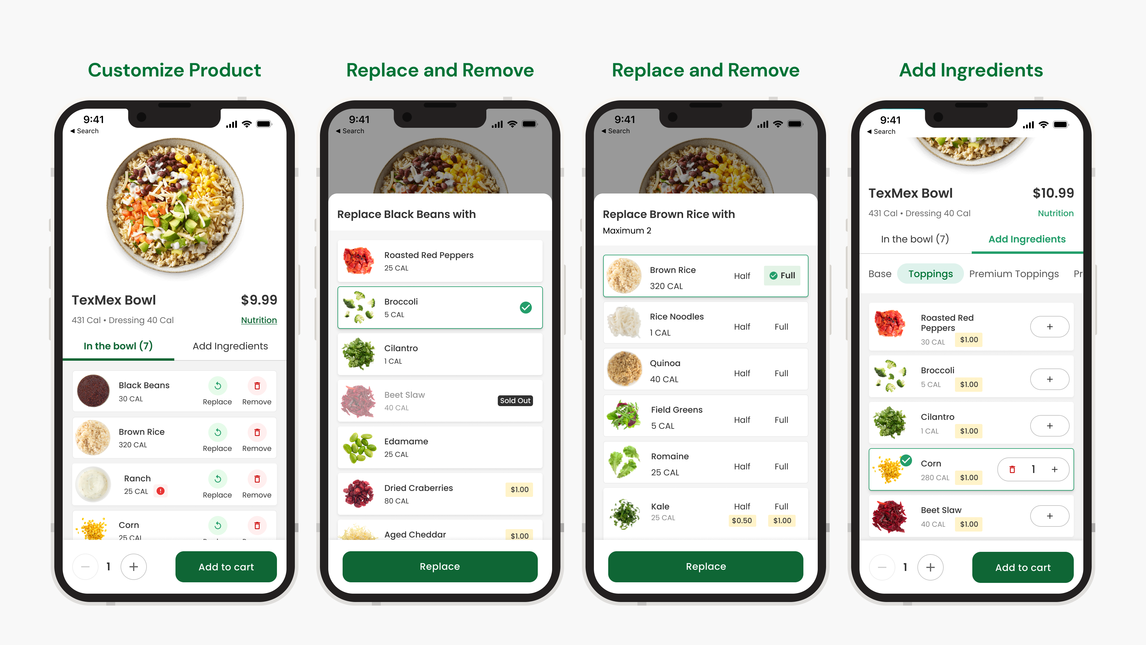
- 01 Order customization. Freshii users substitute, add, and remove ingredients heavily — personalization had to be central, not bolted on.
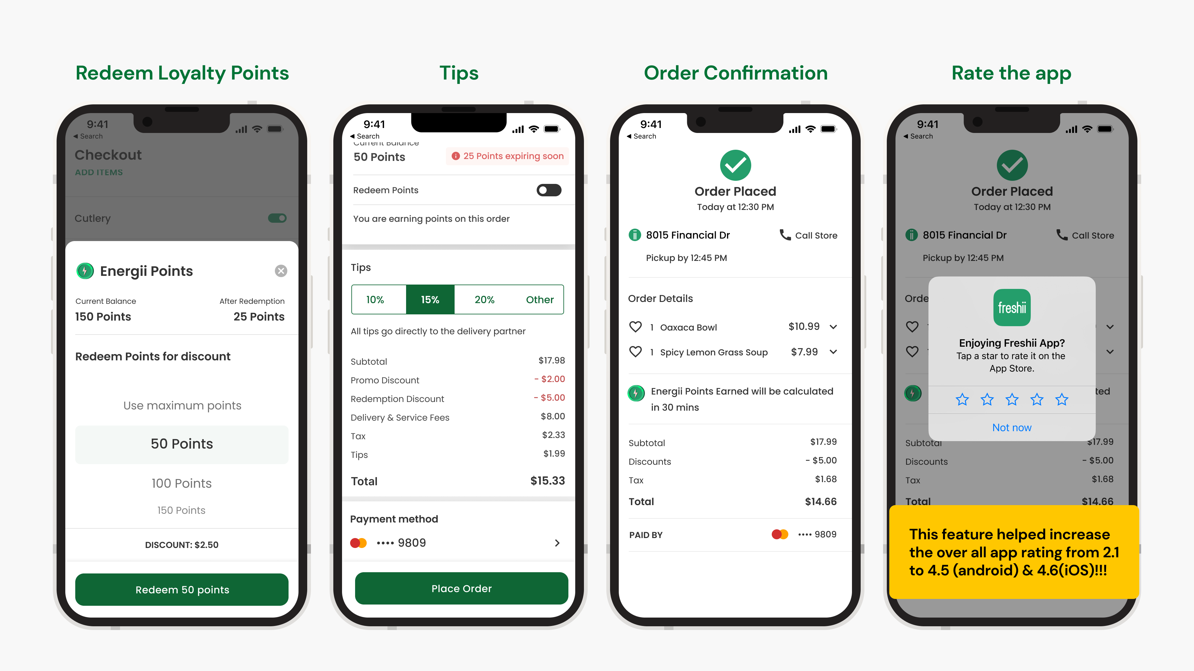
- 02 Loyalty & redemption. Users earned "avocado points" on the old app — a new loyalty program had to allow faster, more flexible redemption.
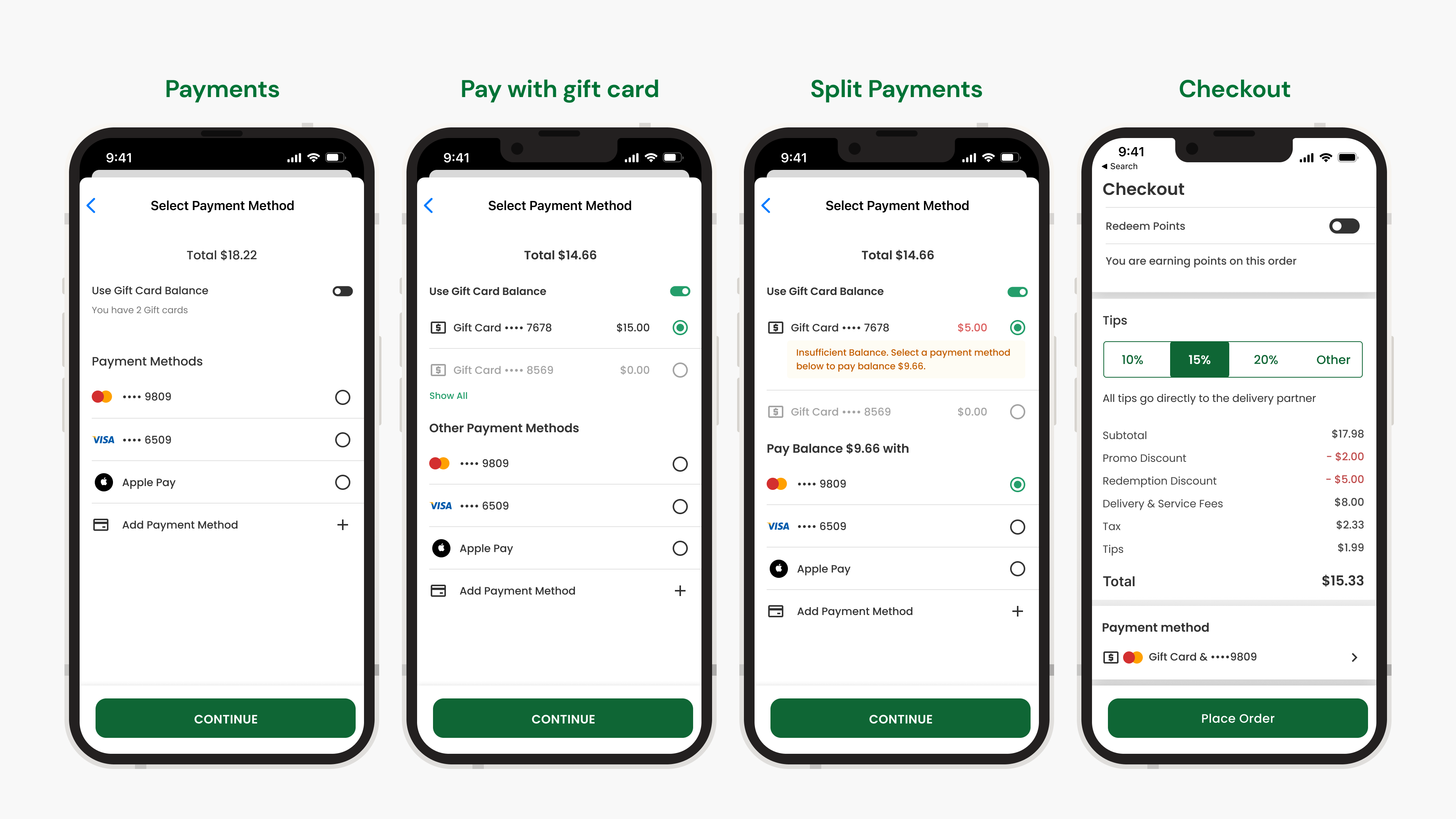
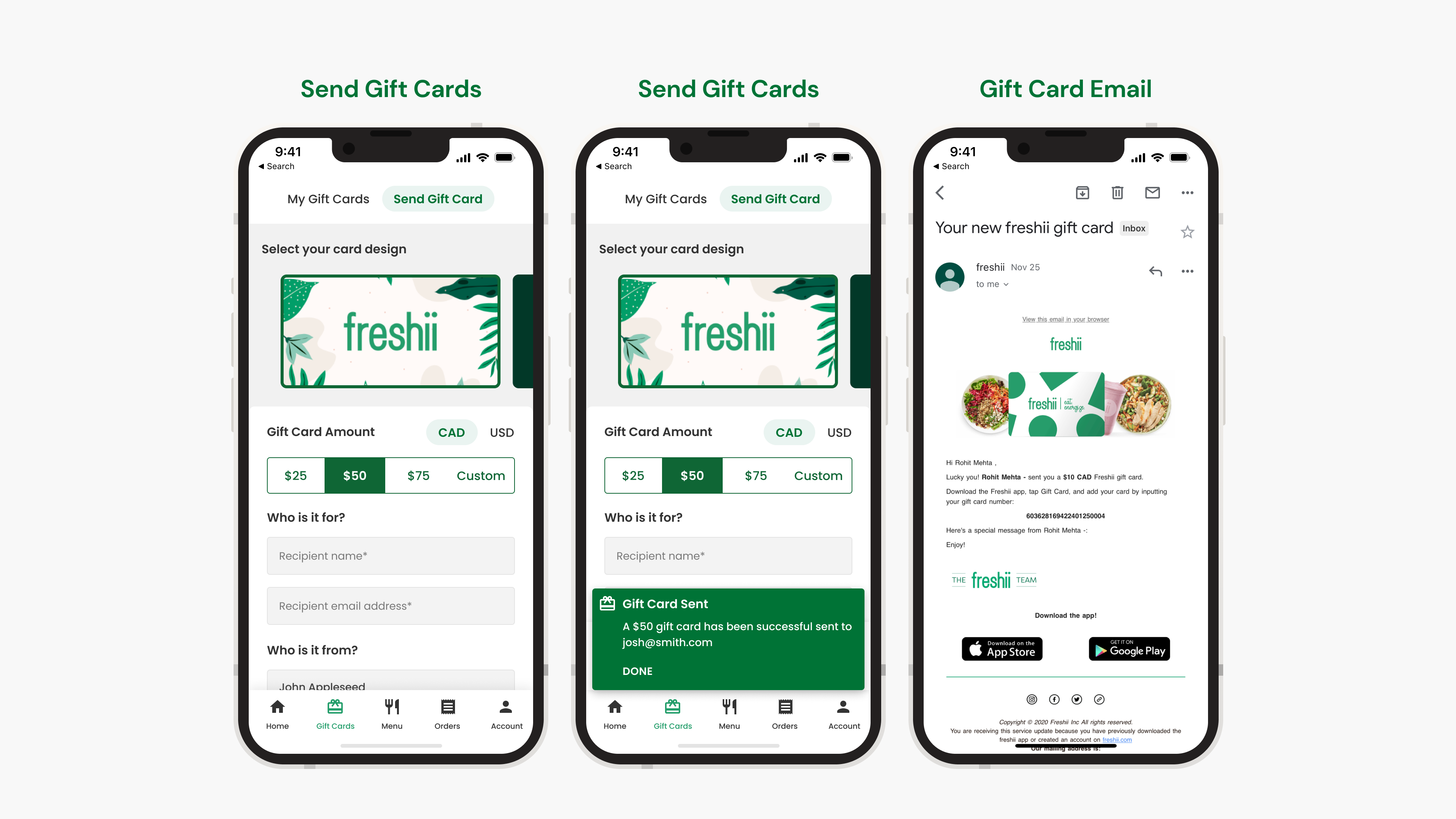
- 03 Gift cards. Let users pay with a Freshii gift card for online orders, and send gift cards to others.
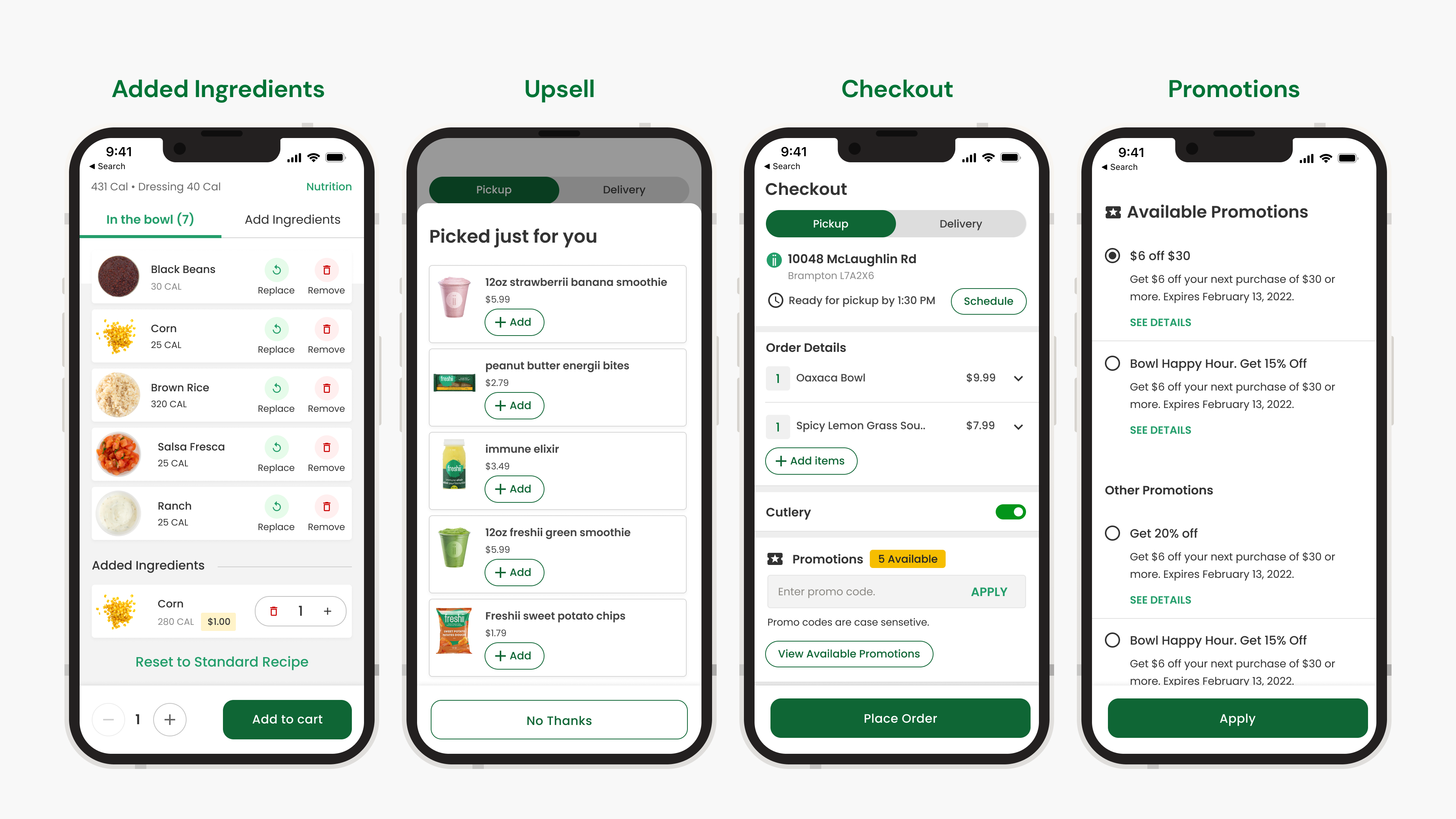
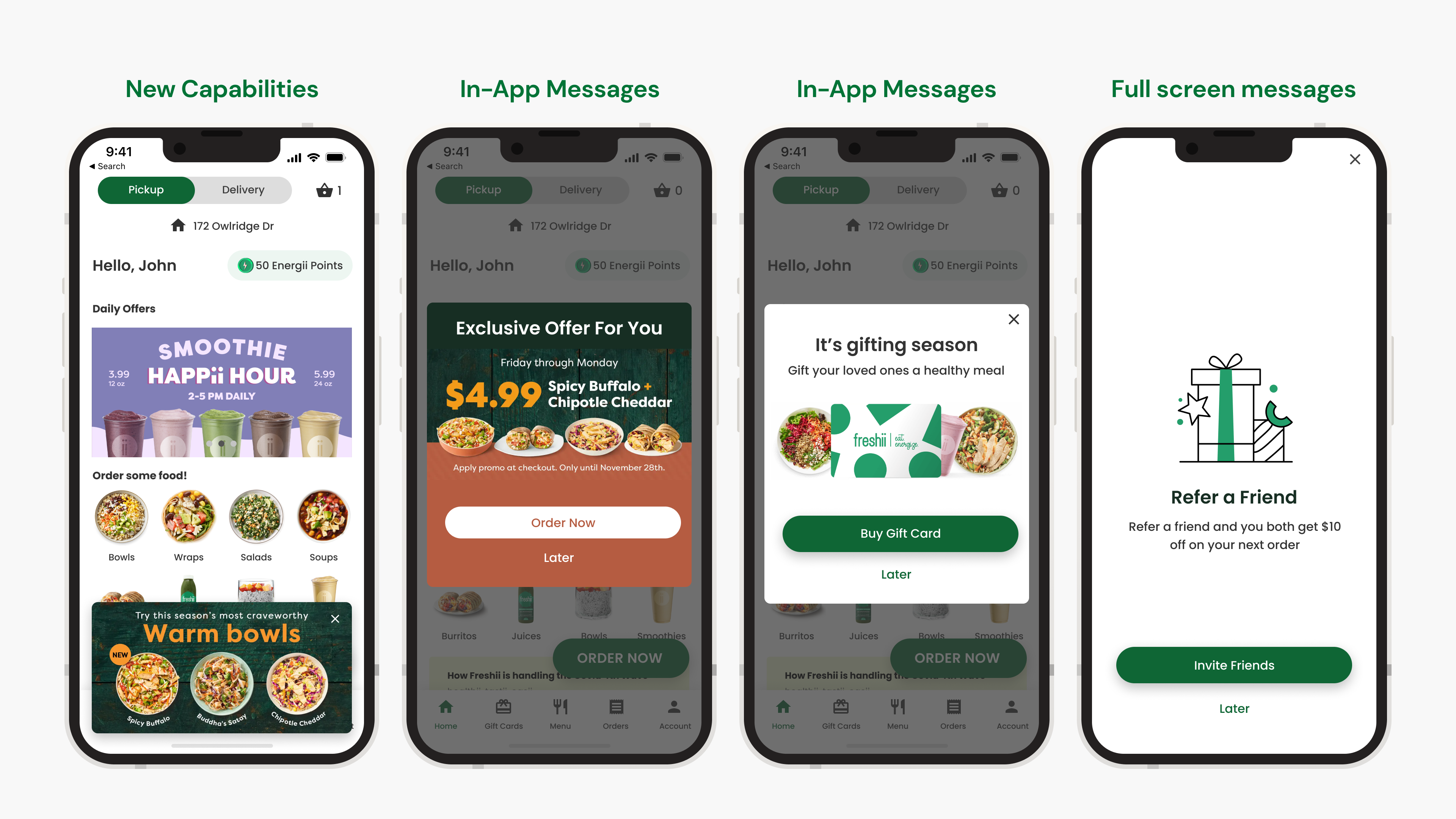
- 04 Promotions. National and local promotions from Freshii HQ and partners, including app-only offers to drive retention and order frequency.
Research
One designer, a team of five, short on resources.
Being the only designer on a lean team of five, I relied on user interviews and guerrilla testing at the stores, competitive research against apps like the ones we were replacing, and ongoing customer feedback surfaced through support teams and Medallia.
Information architecture
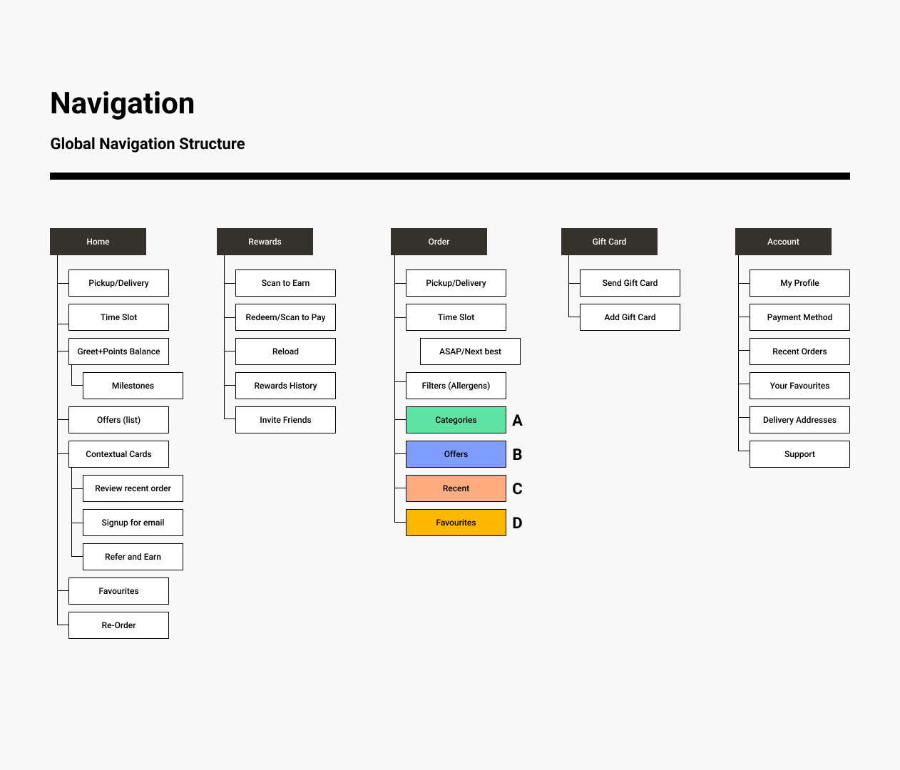
Five sections, mapped before a single screen was drawn.
Home, Rewards, Order, Gift Card, and Account — each broken down to the individual screen and state before wireframes started, so the ordering flow's structure was settled early.
Wireframes
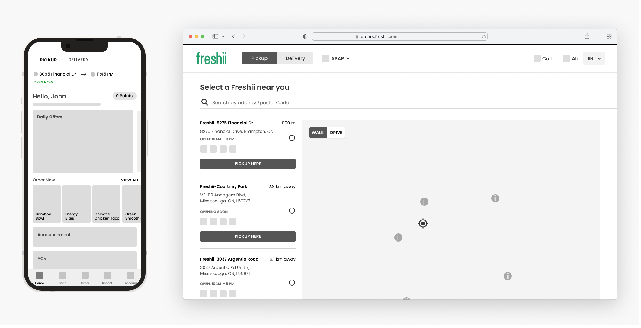
Selected flows, tested in grayscale first.
Home, store selection, menu, and item customization all went through low-fidelity wireframes before any visual design — cheap to change, easy to test against the principles above.
Visual design
Real photography, real prices, real nutrition data.
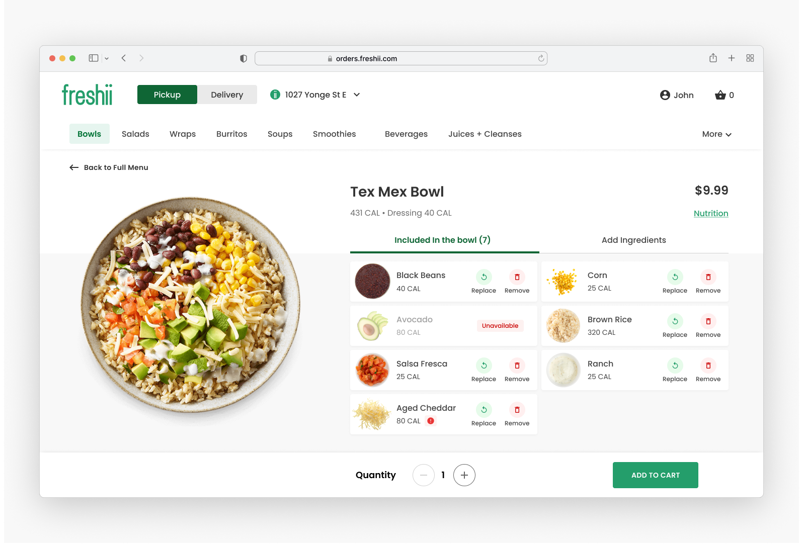
The wireframes became full visual designs across web and mobile web — every ingredient shown with its own photo, calorie count, and price, so customizing a bowl never felt like guessing.
A better home experience
Fewer steps, faster checkout.
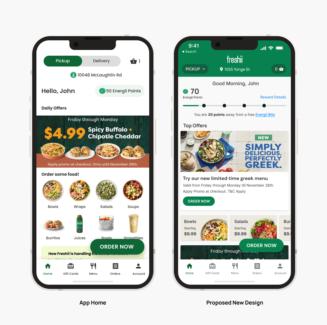
Hypothesis: by decreasing the number of steps, we could speed up ordering and provide a faster checkout experience — and that, in turn, would improve the quality of user engagement.
Expanding to other brands
One platform, re-skinned for a second brand.
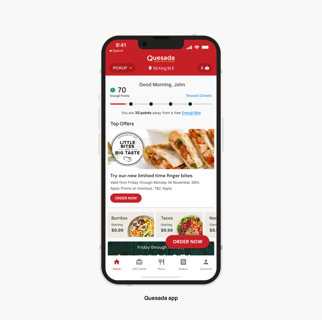
The system was built to scale beyond Freshii — the same ordering platform, re-themed, powered Quesada's app. Proof the architecture wasn't a one-off, it was a platform.
Once the core loop worked, the real work was everything a bowl of rice and beans doesn't show you.
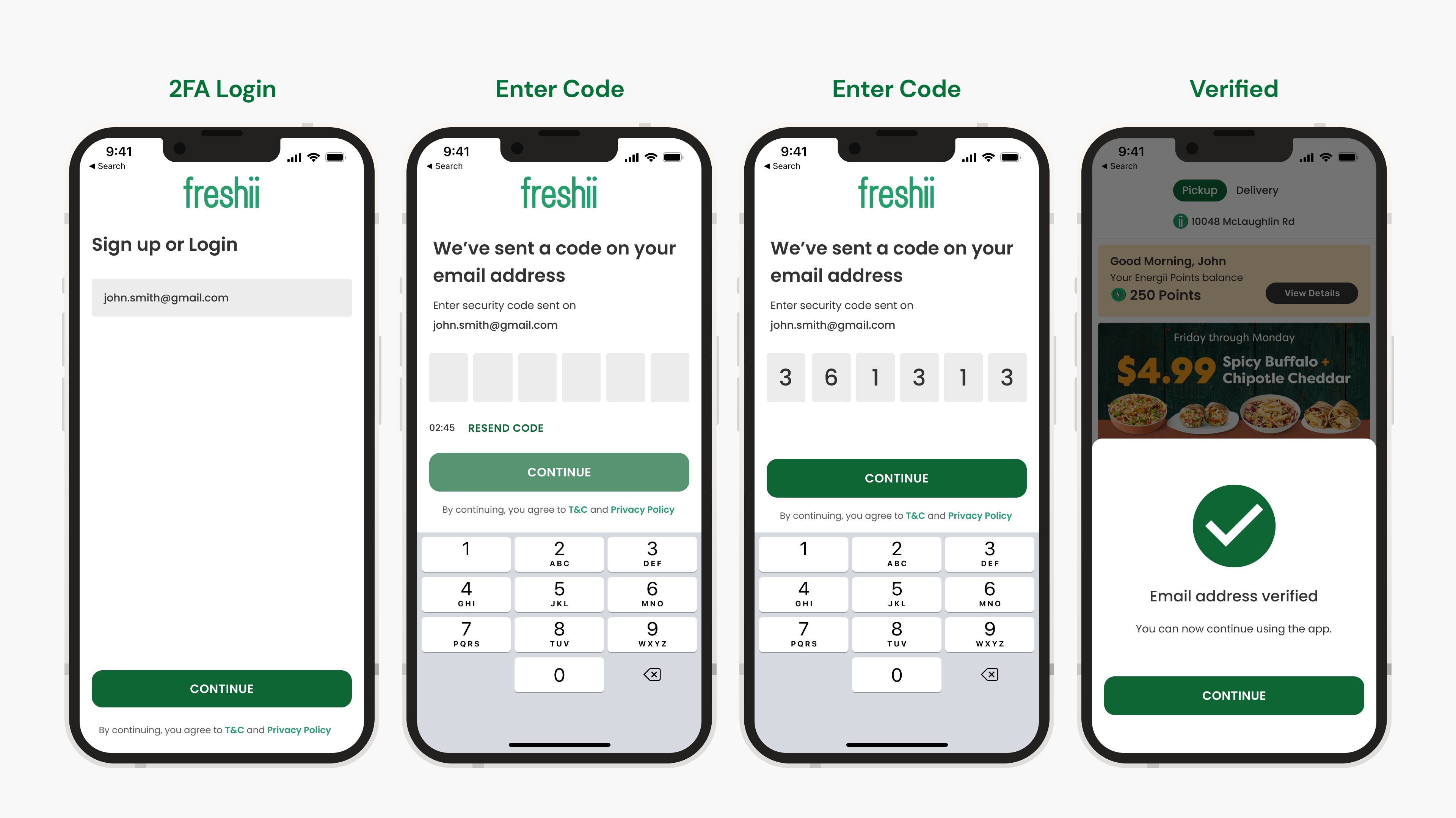
Payments that split across gift cards and cards. Loyalty points that redeem mid-checkout. Two-factor login. Promotions with real restrictions. Every one of these had to work as well as the happy path.
The finished experience
Every flow, designed to the same fidelity.
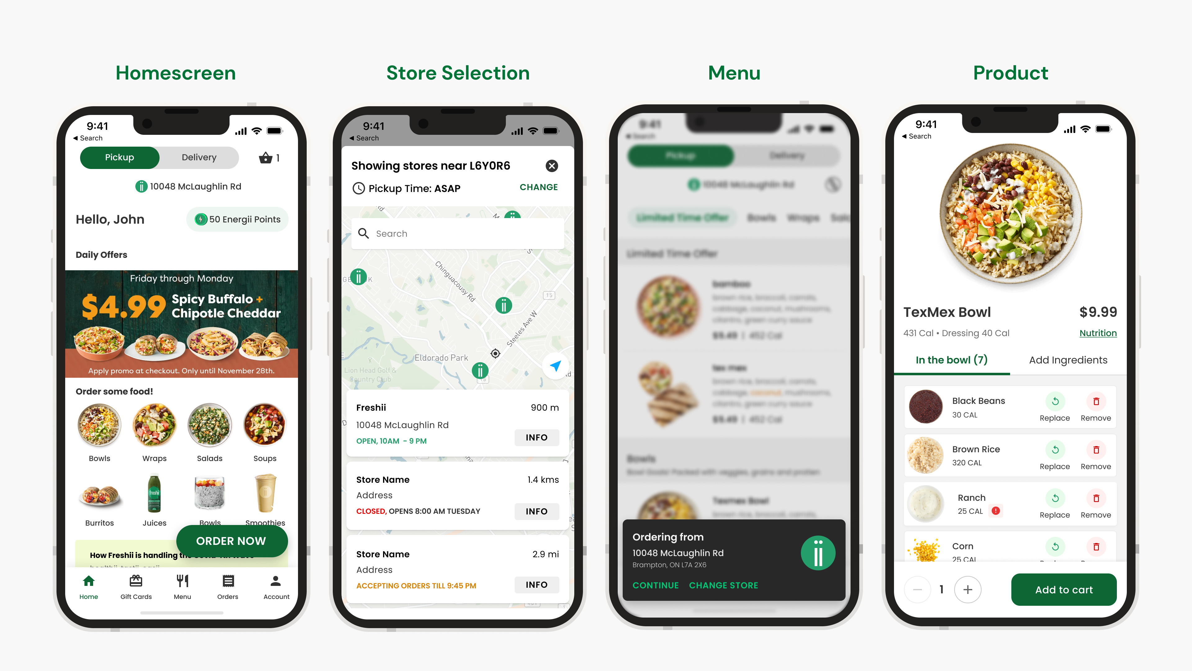
From first launch to order confirmation, each piece of the platform — ordering, customization, checkout, payments, loyalty, gift cards, promotions, security — was designed as its own complete flow, not an afterthought bolted onto the core loop.
Outcome
Key metrics, since launch.
Revenue figures are kept out of the public version of this case study — everything else from the metrics dashboard is below.
155K
Total user count
303K
Total orders
24,000
Monthly active users
8,800
Weekly active users
1,500
Daily active users
10.5%
App as a share of total sales
2.1 → 4.5
App Store rating, Android
→ 4.6
App Store rating, iOS
45 / 28 / 60
Conversion — iOS / Android / Web
Three-plus years on one product is the closest thing design has to compound interest.
Owning both the problem and the solution — first as the designer, then as the PM too — changed how I approach every project since.
What I'd do next: the redesign in this deck (the "upcoming redesign" home screen) shipped after this deck was built — the natural next step is a follow-up on what changed once it went live.