FLIPP · CASE STUDY 03
Endless Browse
When a flyer ends, the browsing shouldn't — surfacing the next relevant deal to turn engagement into revenue.
TIMELINE
2019
ROLE
Senior Product Designer
TEAM
Mission-based revenue team
IMPACT
+28% time per flyer
OVERVIEW
Design, pointed at a revenue gap.
In mid-2019 Flipp spotted a revenue gap and stood up mission-based teams to close it. Endless Browse was the first dedicated push — and a chance to show that design could move a business number, not just a usability one. The idea: when someone finishes a flyer, surface relevant related flyers instead of a dead end.
THE CHALLENGE
Turn the end of a flyer into a beginning.
Flipp runs two kinds of flyers: Premium, which generate revenue, and Organic, which don't. Endless Browse aimed to surface relevant related flyers the moment a user finished their current one — lifting engagement and steering it toward revenue- generating content, without making the app feel like it was hustling.
CONCEPTS
Three ways to say "there's more."
I prototyped several concepts across a spectrum of risk and opportunity.
01
Cross Browse
Surface related flyers alongside the current one as a parallel path to keep exploring.
02
Flyer with a timer
Auto-advance to the next flyer after a beat, with an option to cancel and stay put.
03
Rubber-band next
Pull past the end to reveal the next flyer, with haptic feedback confirming the transition.
THE APPROVED BET
Lowest risk, highest number of stakeholders.
This was high-stakes and crowded — Product, executives, business development, and partner technology all had a seat, and retail partners could object to how their content was surfaced. So we chose the concept with the least business risk: a clearly delineated section that appears after the flyer ends, rather than anything that hijacks the reading experience.
VALIDATION
Do people notice — and do they mind?
I tested with ten participants — five existing Flipp users and five new ones — to learn whether people understood where a flyer ended, what the new blue section was, and what they'd do next. Most clearly distinguished the flyer's end from the store tiles that followed. They weren't expecting the tiles, but found them intriguing and leaned toward store-based navigation.
SHIPPED
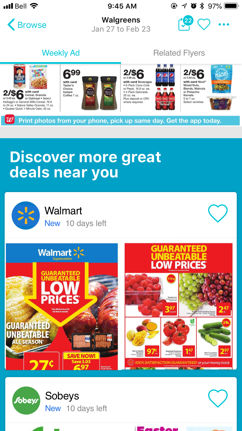
"Discover more great deals near you."
The shipped design closes a flyer with a distinct section of related, location-relevant flyers — clearly separated from the flyer itself, easy to dismiss, and easy to dive into.
RESULTS
More time, real conversion, honest trade-off.
After launch, time spent per flyer rose 28% and the feature drove a 12% premium engaged-visit conversion rate. Net revenue impact came out roughly neutral — it cannibalized engaged visits from concurrent marketing tactics — a genuinely useful finding for how the team valued placements going forward.