OLA · CASE STUDY 03
Drop Location on PWA
Cutting driver cancellations on Ola Lite — without making the app heavier for the riders who chose it to stay light.
TIMELINE
2018
ROLE
Senior Product Designer
PRODUCT
Ola Lite (PWA)
IMPACT
Targets 17% cancelled rides
OVERVIEW
A map-less app, by design.
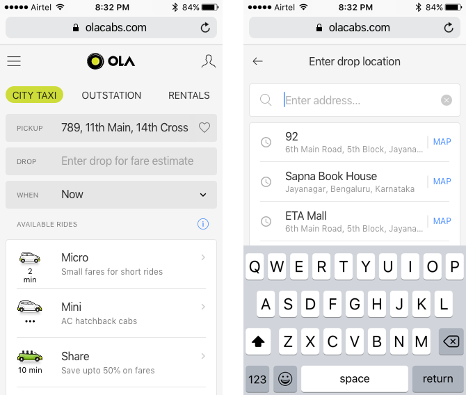
Ola Lite — the Progressive Web App — deliberately avoided maps to stay light and fast on data. Riders entered pickup and drop by text suggestions. It kept the app tiny, but it came at a cost: pickup points were often wrong, sometimes far from where the rider actually stood. A map picker existed, but it was buried and undiscoverable.
THE CHALLENGE
Wrong pin, cancelled ride.
Inaccurate pickups had a real, measurable cost: about 17% of rides were cancelled by drivers after they'd already reached the pickup point. Native apps avoided this with always-on maps for visual confirmation. But loading a map for everyone would break the PWA's whole promise — light, fast, easy on data — and the accuracy problem only hit a fraction of riders.
THE SOLUTION
A map only when you need one.
The fix was a location snapshot on the confirmation screen — a small, static preview of your pickup. Looks right? Confirm and go. Looks off? Tap to open the full map and adjust. It gives every rider visual confirmation before confirming the ride, without loading a live map for anyone who doesn't need it. I explored several interaction models and finalized the lightest one.
WHY IT WORKS
Accuracy for all, weight for few.
The snapshot approach hits three goals at once: riders see their location before confirming, the full map loads only when someone spots a problem, and Ola PWA stays light on data for 92% of users. The cancellation problem gets solved where it happens — without taxing the experience for everyone else.